Creating range plot
What is a range plot?
Range plots show exactly two dots on a line and connect them. These are great if you want to draw attention to the distance between the values more than to the values themselves. For example a comparison between the minimum and maximum temperature over 10 years can be visualized better with a range plot.
Using the share operator
Share operator creates a new composed variable instance from multiple variables. This is required when we need to map multiple fields in a single axis. For example, we want to show minimum temperature and maximum temperature on y-axis, then we have to create a shared field.
Pass fields to plot in the share operator and attach the result in rows/columns of the chart:
const { muze } = viz;
const { share } = muze.Operators;

const MaxTempField = "maxTemp";
const MinTempField = "minTemp";
const DateField = "date";

const sharedField = share(MaxTempField, MinTempField);

muze.canvas().rows([sharedField]).columns([DateField]).mount("#chart");
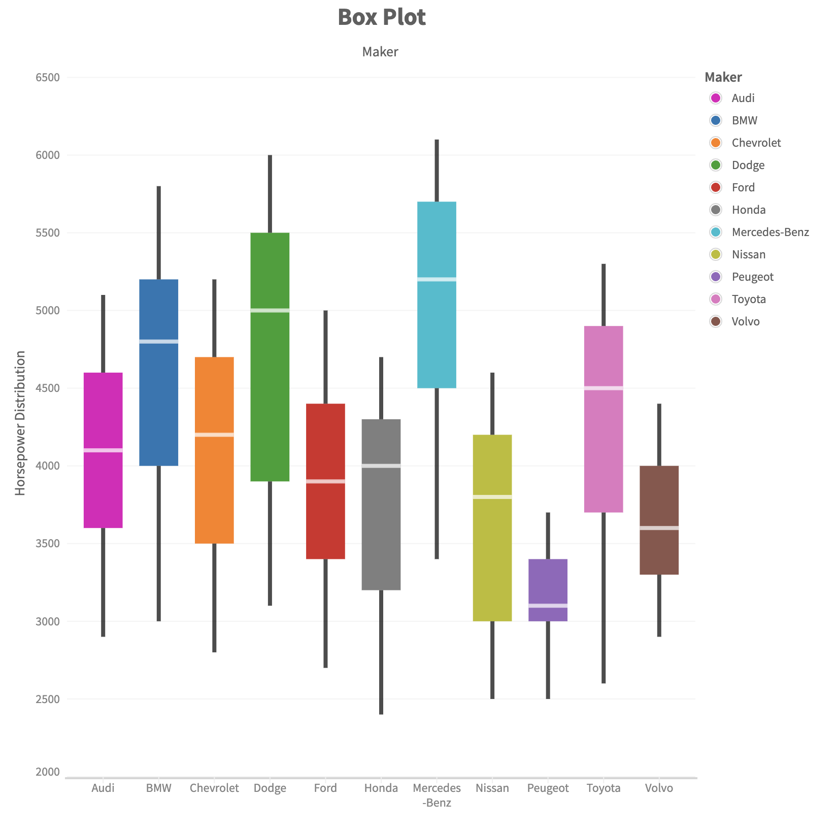
Example
Muze's box plot sample uses a shared field in rows.
const { muze } = viz;

const data = [
  {
    Maker: "BMW",
    min: 3000,
    q1: 4000,
    median: 4800,
    q3: 5200,
    max: 5800,
  },
  {
    Maker: "Chevrolet",
    min: 2800,
    q1: 3500,
    median: 4200,
    q3: 4700,
    max: 5200,
  },
  {
    Maker: "Dodge",
    min: 3100,
    q1: 3900,
    median: 5000,
    q3: 5500,
    max: 6000,
  },
  {
    Maker: "Ford",
    min: 2700,
    q1: 3400,
    median: 3900,
    q3: 4400,
    max: 5000,
  },
  {
    Maker: "Peugeot",
    min: 2500,
    q1: 3000,
    median: 3100,
    q3: 3400,
    max: 3700,
  },
  {
    Maker: "Volvo",
    min: 2900,
    q1: 3300,
    median: 3600,
    q3: 4000,
    max: 4400,
  },
  {
    Maker: "Toyota",
    min: 2600,
    q1: 3700,
    median: 4500,
    q3: 4900,
    max: 5300,
  },
  {
    Maker: "Honda",
    min: 2400,
    q1: 3200,
    median: 4000,
    q3: 4300,
    max: 4700,
  },
  {
    Maker: "Nissan",
    min: 2500,
    q1: 3000,
    median: 3800,
    q3: 4200,
    max: 4600,
  },
  {
    Maker: "Mercedes-Benz",
    min: 3400,
    q1: 4500,
    median: 5200,
    q3: 5700,
    max: 6100,
  },
  {
    Maker: "Audi",
    min: 2900,
    q1: 3600,
    median: 4100,
    q3: 4600,
    max: 5100,
  },
];

const schema = [
  {
    name: "Maker",
    type: "dimension",
  },
  {
    name: "min",
    type: "measure",
  },
  {
    name: "q1",
    type: "measure",
  },
  {
    name: "median",
    type: "measure",
  },
  {
    name: "q3",
    type: "measure",
  },
  {
    name: "max",
    type: "measure",
  },
];

let dm = new muze.DataModel(muze.DataModel.loadDataSync(data, schema));

const MakerField = "Maker";
const MinField = "min";
const MaxField = "max";
const Q1Field = "q1";
const MedianField = "median";
const Q3Field = "q3";
const DistributionLabel = "Horsepower Distribution";

muze
  .canvas()
  .rows([muze.Operators.share(MinField, MaxField, Q1Field, MedianField, Q3Field)])
  .columns([MakerField])
  .layers([
    {
      mark: "bar",
      encoding: {
        y: Q3Field,
        y0: MedianField,
        color: MakerField,
      },
    },
    {
      mark: "bar",
      encoding: {
        y: MedianField,
        y0: Q1Field,
        color: MakerField,
      },
    },
    {
      mark: "tick",
      encoding: {
        y: Q1Field,
        y0: MinField,
        color: {
          value: () => "black",
        },
      },
    },
    {
      mark: "tick",
      encoding: {
        y: MedianField,
        color: {
          value: () => "#fff",
        },
      },
    },
    {
      mark: "tick",
      encoding: {
        y: MaxField,
        y0: Q3Field,
        color: {
          value: () => "black",
        },
      },
    },
  ])
  .config({
    axes: {
      y: {
        name: DistributionLabel,
      },
    },
  })
  .title("Box Plot", { position: "top", align: "center" })
  .data(dm)
  .width(800)
  .height(800)
  .mount("#chart");
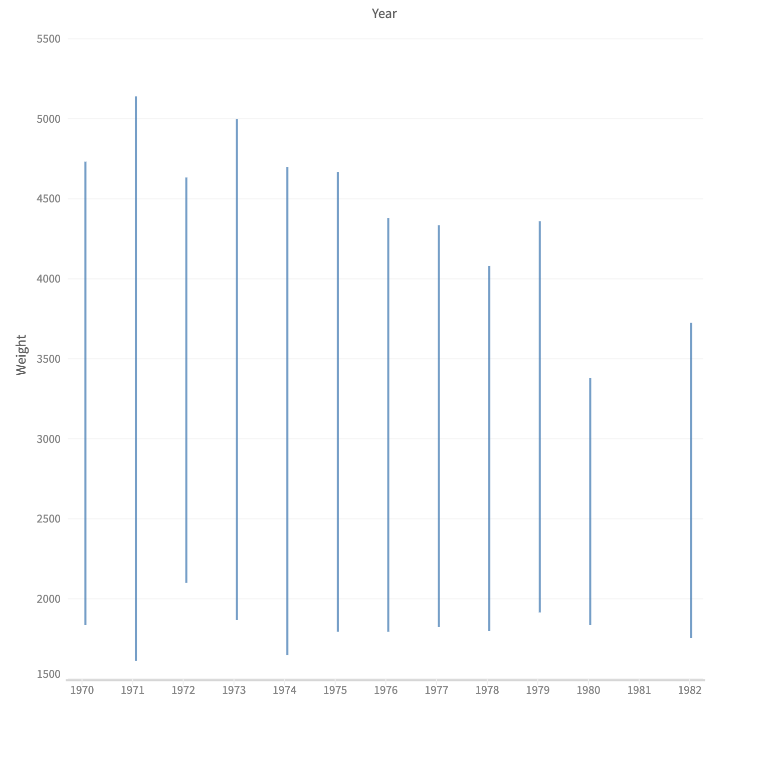
Using encoding channels to define a range plot
Each layer has an encoding object configuration which accepts x0, x, y0, y and color parameters.
To create a vertical range plot, map fields to y0 and y. To create a horizontal range plot, map fields to x0 and x. Optionally, also pass a function in color.value to color the layer plots.
Example
const { muze, getDataFromSearchQuery } = viz;

const data = getDataFromSearchQuery();

const share = muze.Operators.share;

const WeightField = "Weight_in_lbs";
const MinWeightField = "Min Weight";
const MaxWeightField = "Max Weight";
const YearField = "Year";

// Min value of weight for a group
dm = data.calculateVariable(
  {
    name: MinWeightField,
    type: "measure",
    defAggFn: "min",
  },
  [WeightField],
  (val) => val,
);

// Max value of weight for a group
dm = dm.calculateVariable(
  {
    name: MaxWeightField,
    type: "measure",
    defAggFn: "max",
  },
  [WeightField],
  (val) => val,
);

muze
  .canvas()
  .rows([share(MaxWeightField, MinWeightField)])
  .columns([YearField])
  .layers([
    {
      mark: "tick",
      encoding: {
        y: MaxWeightField,
        y0: MinWeightField,
        size: {
          value: () => 0.001,
        },
      },
      interpolate: "catmullRom",
    },
  ])
  .config({
    axes: {
      y: {
        name: "Weight",
      },
    },
  })
  .data(dm)
  .width(700)
  .height(700)
  .mount("#chart");